Every operating system consists of a global UI, where all UI elements and components are displayed according to it. If you’re a Windows user, you may have noticed that all applications open in a similar “window” interface, the dialog boxes, the minimize, maximize and close buttons are all identical across different applications within Windows. The same goes for Mac OS as well. In the case of mobile UI (Android), that global UI which structures all of the components for familiar usability across different apps, is called “System UI”.
In this article, we’ll discuss the design language to be followed, when creating mobile UI of an app for devices running Google’s default version of Android.
Design Guidelines for Components
Every operating system has a set of rules and principles that govern how interactive elements and components are displayed on screen. These rules are also called “Design Language” or “Design Guidelines”. Following is a summary of how UI components are rendered in Android.
|
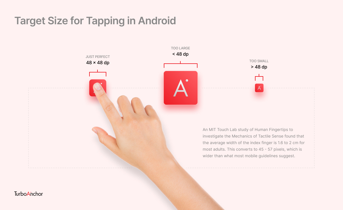
Target Size for Tapping |
48 x 48 dp (device-independent pixels) |
|
Main Navigation for Apps |
Tab Buttons at the top |
|
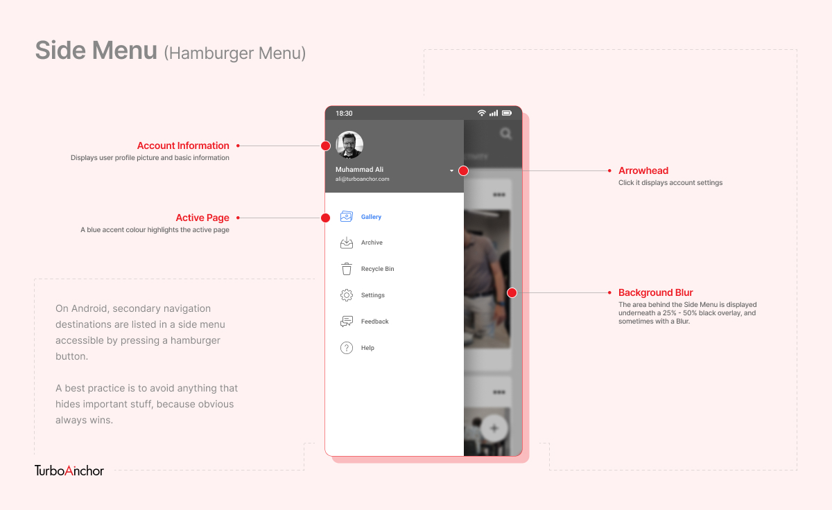
Secondary Navigation for Apps |
Side Menu (Hamburger Menu) |
|
Primary CTA Button |
Floating CTA Button |
|
Secondary Actions |
Top Right on Navigation Bar |
|
Single Choice Options |
List with Radio Buttons |
|
Multiple Choice Options |
List with Checkboxes |
|
Undo Pattern |
Allowed by a Temporary Tooltip at the Bottom |
Suggested Read: Introduction to User Interface Design
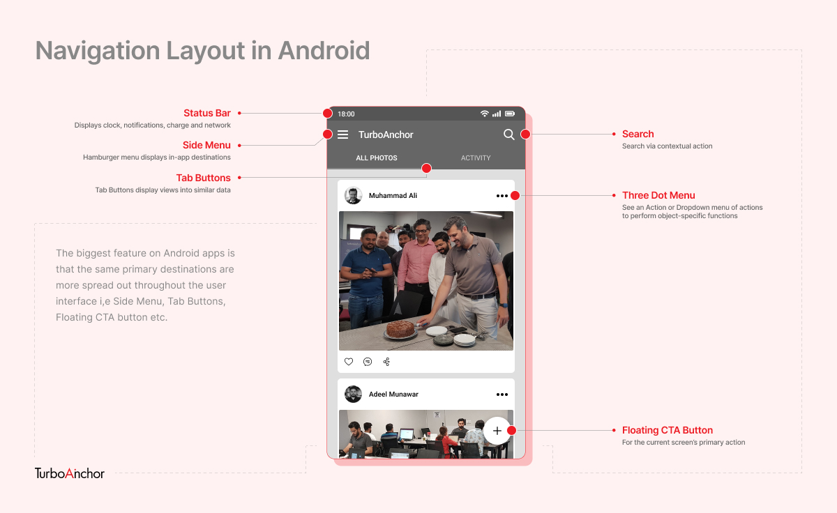
Navigation Layout of Mobile UI
In Android, the page title is displayed on the left. If it is a top-level page, then there’s usually a Side Menu next to it, which lets you navigate sub-level features within the app. The Search function is on the right, and displayed as an icon. To navigate similar data within the page, there are Tab Buttons below the Navigation Bar. The primary function is displayed as a Floating CTA button. For example, in the Messages app, this button lets you compose a new text message.
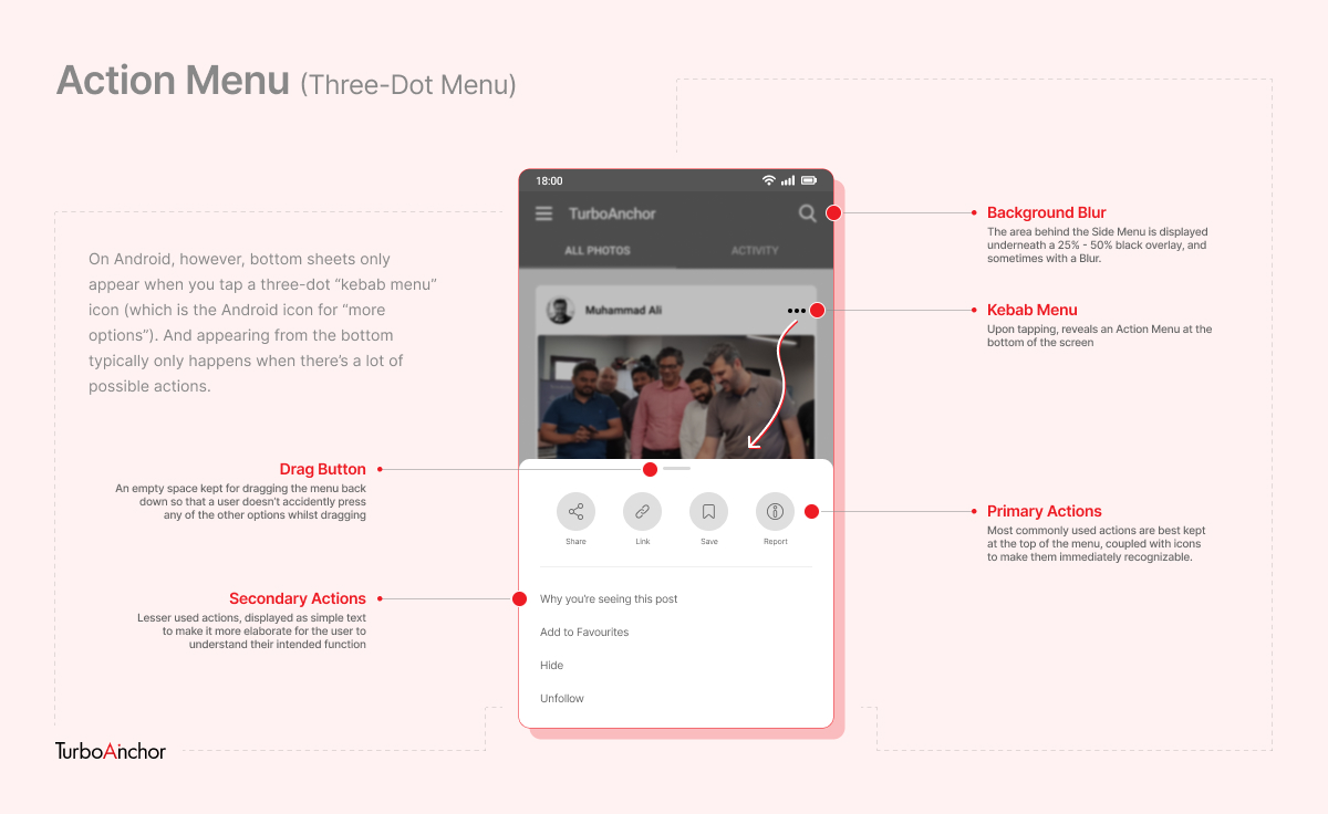
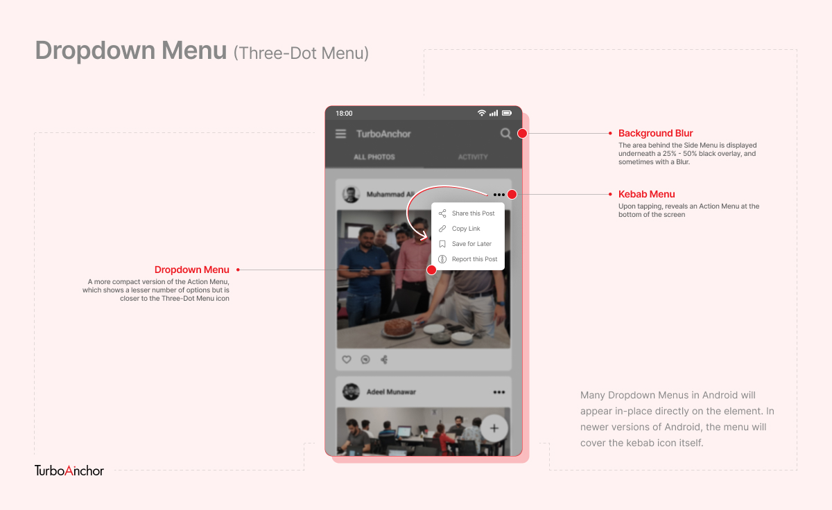
Three-Dot Menus
In Android, secondary functions in an app are either displayed as an Action Menu at the bottom of the screen or as a more compact Dropdown Menu, when obstruction is to be reduced. The button by which it is accessed is also called the Kebab Menu because of how it is shaped (i.e. three dots).
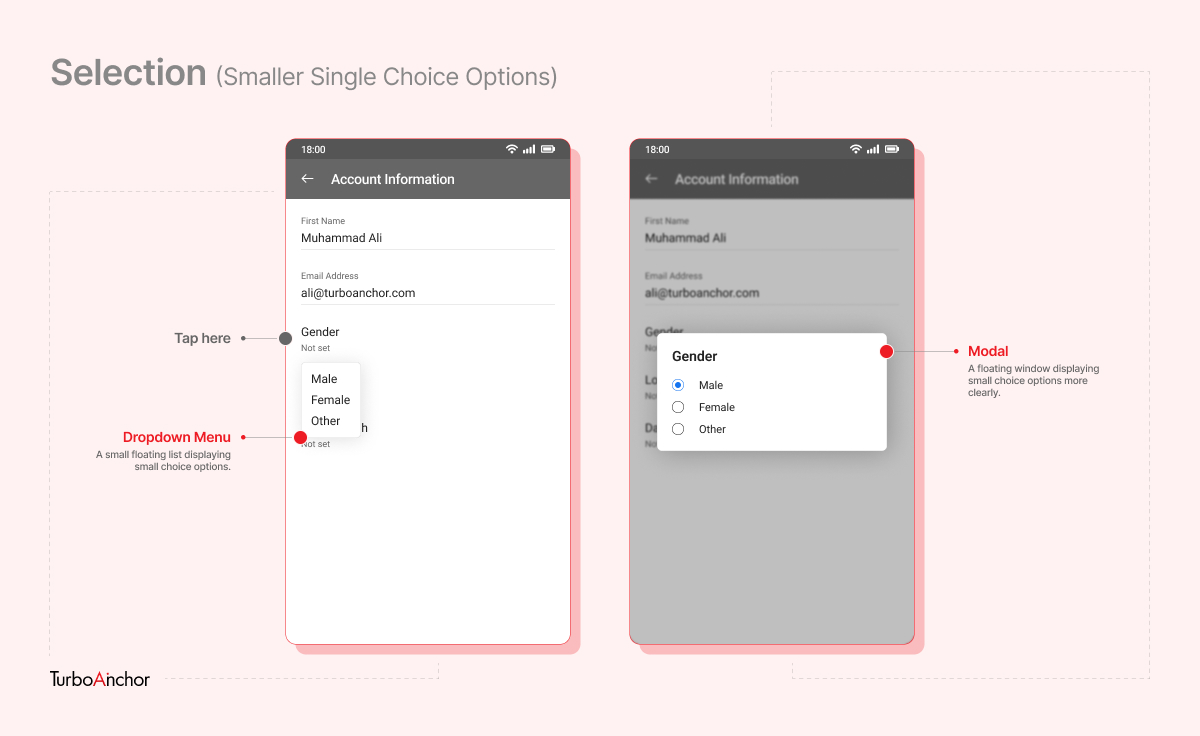
Selection
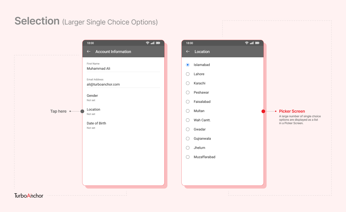
Single Choice Options
Single Choice Options is a list of options where you can only select one of them. They are often displayed next to a “Radio Button” in all sorts of operating systems, including Android. A smaller list can be displayed as a drop down menu or inside a “Modal” (a floating window), center aligned to the screen.
Lists with a larger number of options need to be displayed in the “Picker Screen” which covers the entire width of the display.
In Android, to go “Back” a step, you can either use the icon in the upper “Title Bar”, using “Gesture Controls” or using the default “Navigation Bar” at the bottom.
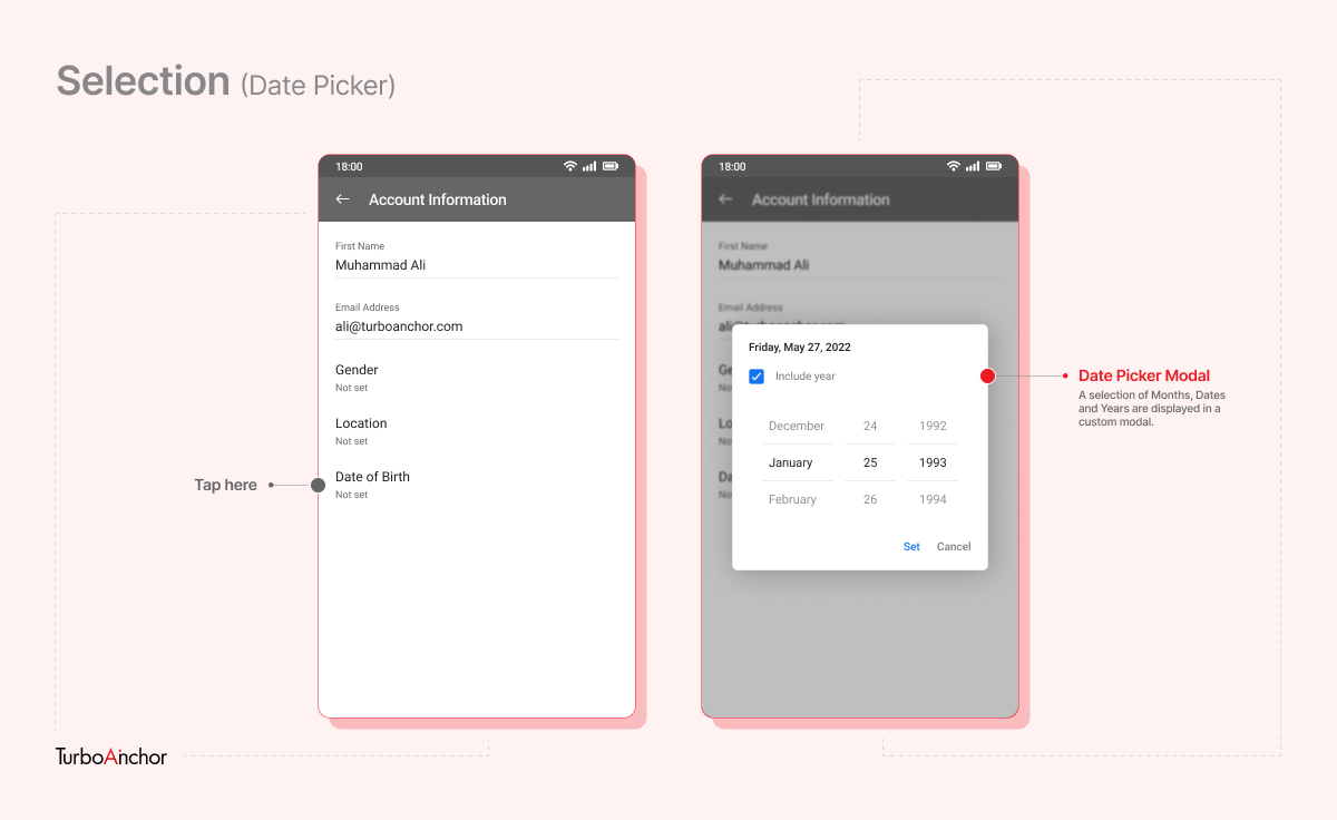
Date Picker
In Android, the “Date Picker” appears inside of a “Modal”.
Typography for Mobile UI
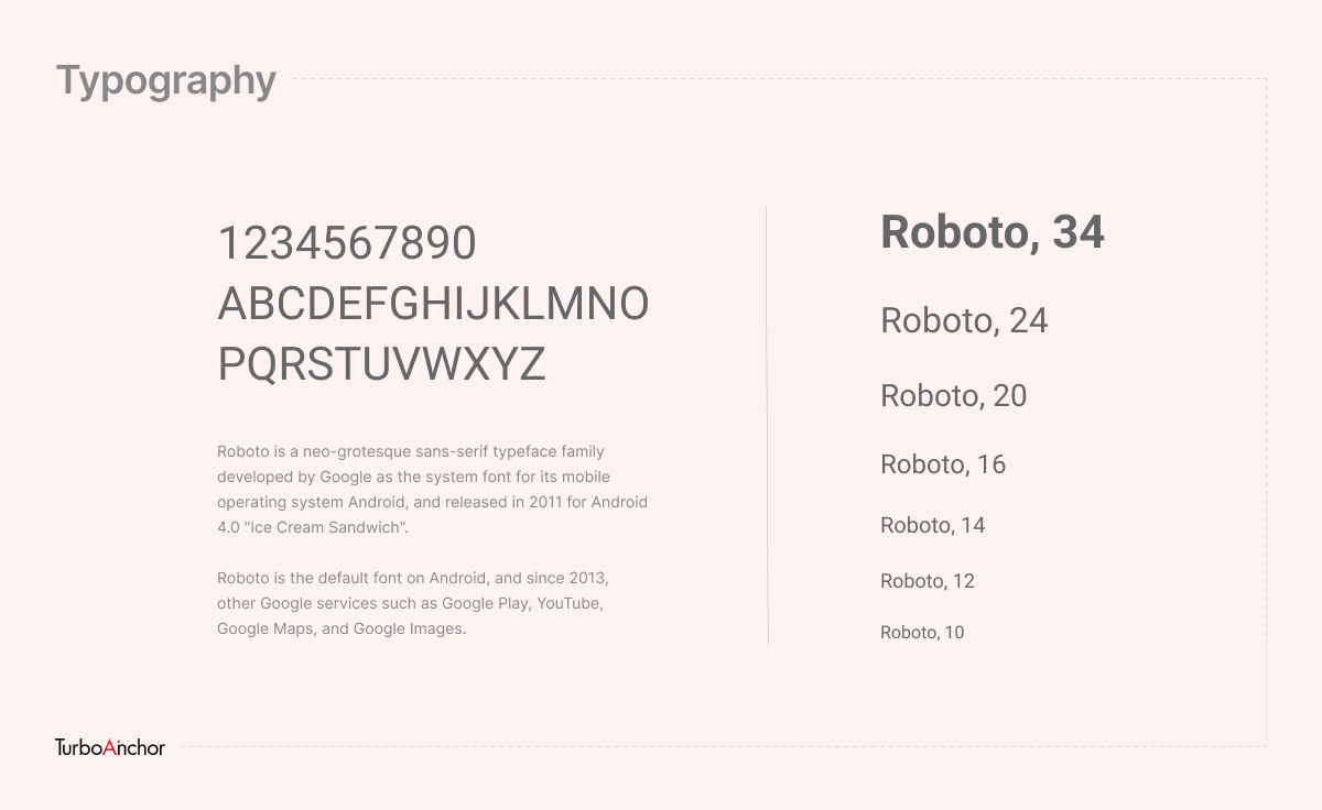
The default typeface in Android is Roboto. It has been implemented since 2011, when Google released Android 4.0 Ice Cream Sandwich.
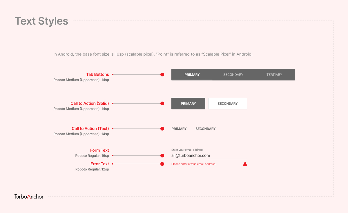
Text Styles
Fonts on a display are usually measured in “Points”. Android uses the term “Scalable Pixel (sp)” for “Point”. The base font size is 16sp.
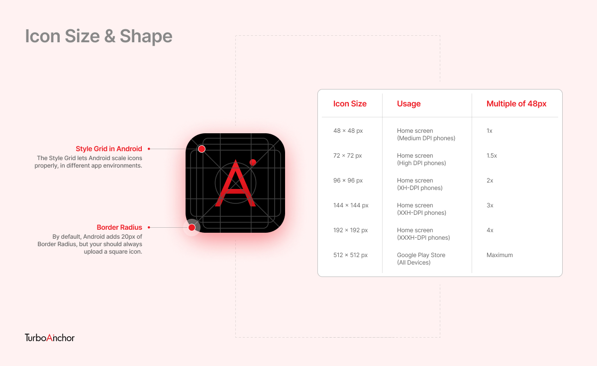
App Icons
The minimum icon size in Android is 48 x 48 px, as that is the ideal tap size for a human finger. An icon can be scaled in multiples of 48px, therefore design software like Figma and Illustrator have 1x, 2x, 3x and 4x export options.
Also Read: