For someone interested in working as a designer in the tech world, you might have come across many different types, such as UX, UI and graphic design, web design, and visual design. People are mostly aware of graphic design as it has been quite commonly used for a long time. But when it comes to “Visual design.” What is it? & How’s it different from others?
Visual design is about transforming the appearance of a product/site via font, colors, images, typography, and space. It’s often considered another term for UI design. To understand it more extensively let’s explore more about it!
Elements of Visual design
1- Line
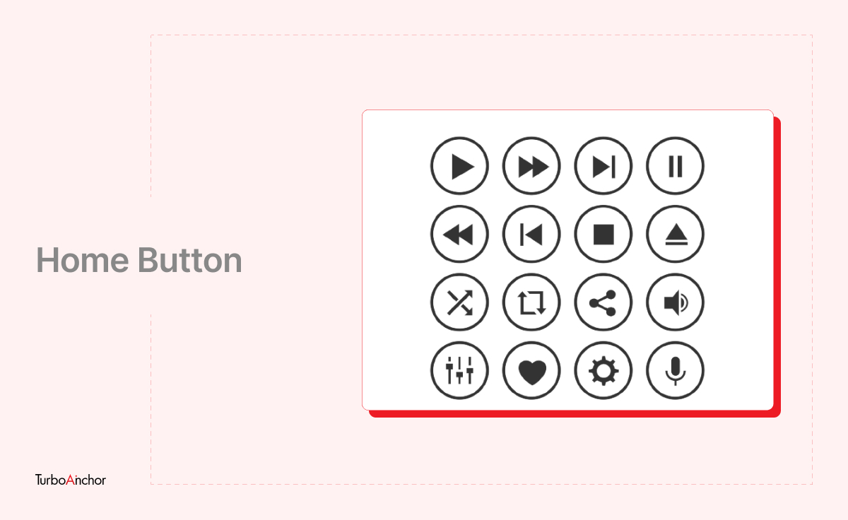
There’s so much variability you can achieve with a line ranging from Straight, geometric, horizontal/vertical/diagonal, thick/thin, bold, dashed long/short, or in color.
For Example, “Home buttons” you might have observed on website/app icons designed with just outlines.
2- Shape
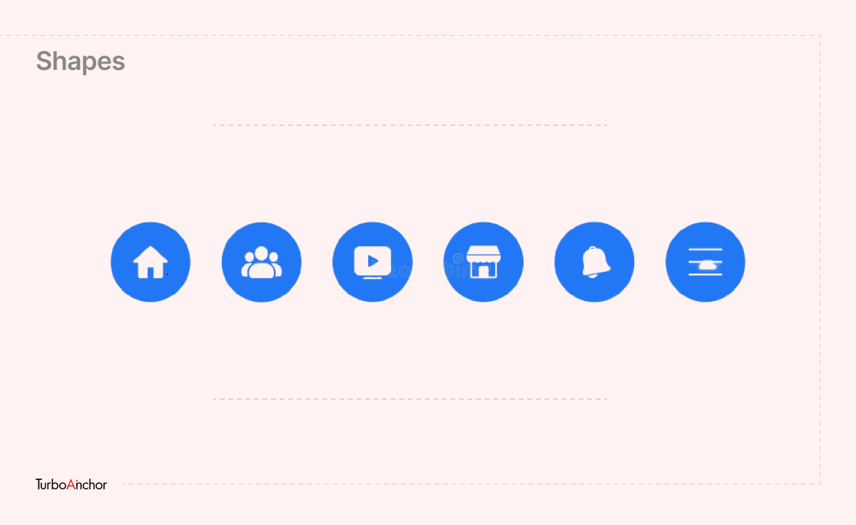
Connecting one end of a line to the other creates a shape. By connecting lines, colors, or textures, designers can design various shapes (like circles, triangles, squares, etc.).
For Example, Icons or buttons to an app/website that consists of an outline with any circle or square image making it more dynamic.
3- Color
To add an impact and make your design, image, or text more attractive you can simply add color.
4- Texture
It refers to the surface of an object/shape. Texture can add volume to your design as it adds more depth and detail.
For example, Like wooden, sand, and skin effects on Illustrations.
5- Typography
It’s the art of arranging a message in a readable and aesthetically-pleasing composition. In simple words, the text is represented in the form of design by adding spacing and changing font size or colors.
6- Form
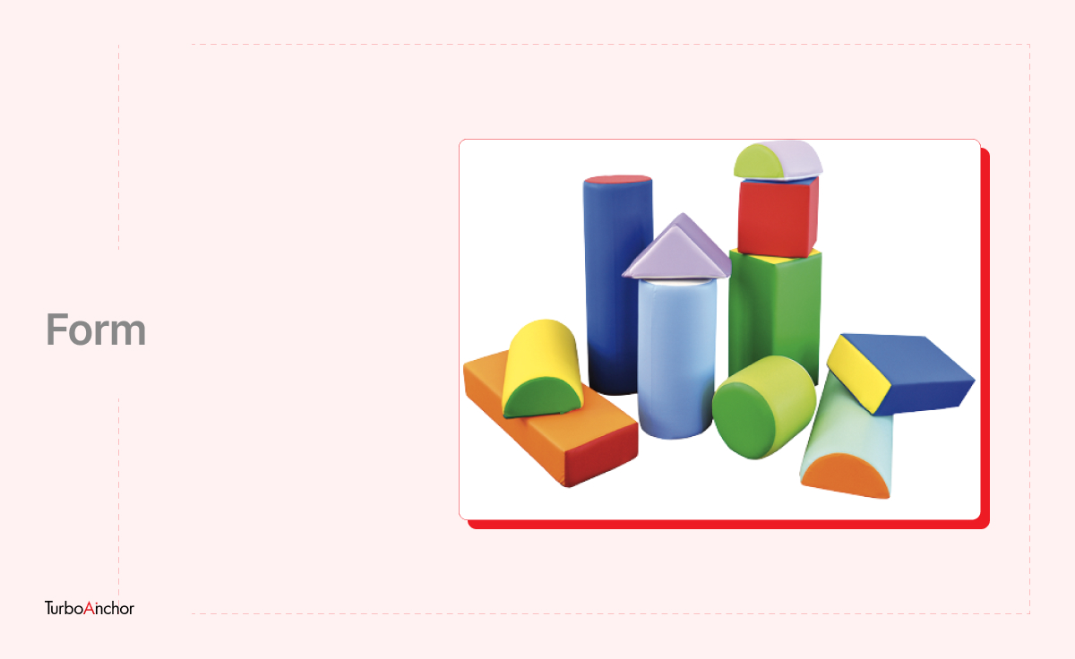
It’s referred to as three-dimensional objects or shapes. These designs are gaining popularity as they become more common to create. Forms are a combo of two or more shapes; their purpose is to create depth.
7- Value
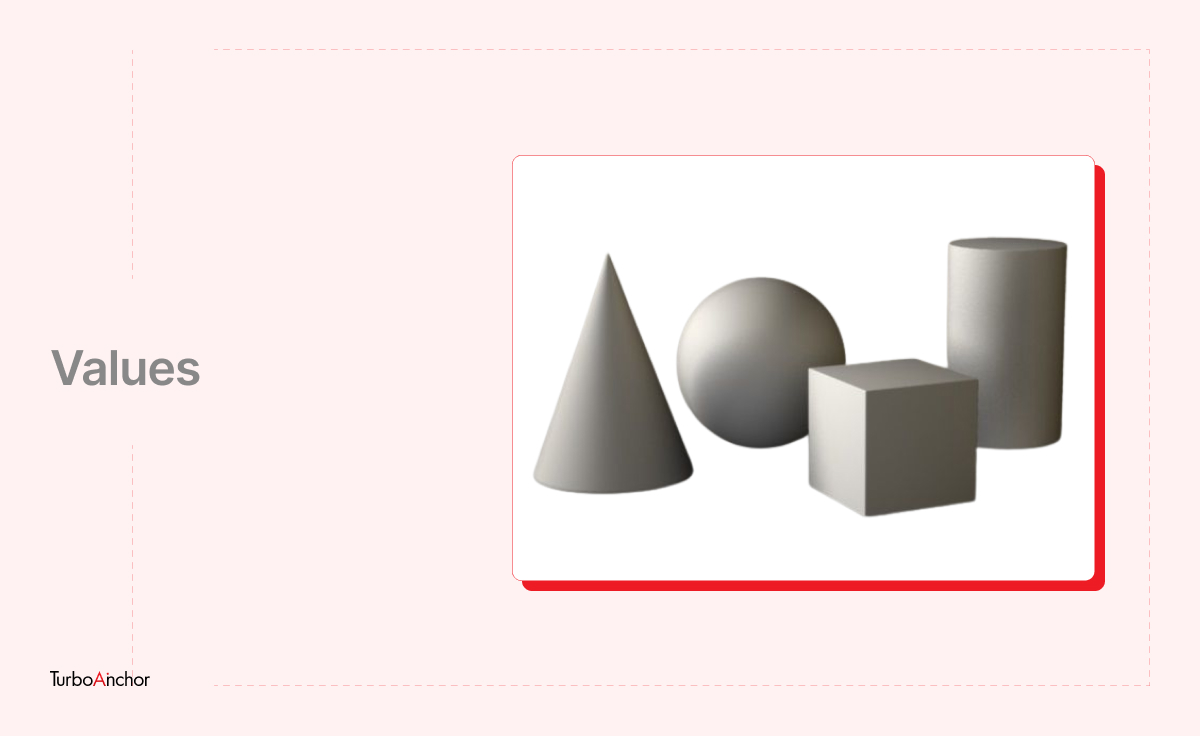
Also known as Tone refers to the amount of lightness or darkness an object or shape possesses. It helps you add dimensions to your design. You can turn an image to look two-dimensional or three-dimensional through shadow and highlights.
What are the Principles of Creating Visual Design in UX?
A visual design principle involves arranging the elements mentioned above and effectively bringing them together in a way that creates intent.
Following are the principles of visual-design principles that impact UX,
- Unity
- Scale
- Gestalt
- Visual Hierarchy
- Contrast
- Dominance
- White Space
Unity
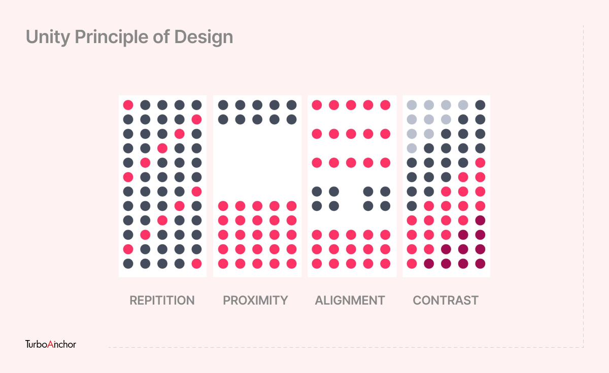
Design tends to work out best in which parts fit together well and form a united whole. This principle pulls together all the other design page elements to look balanced. A perceived union is achieved through proximity, alignment, continuation, and repetition.
For example, choosing two different colors that need to go along with each other appropriately.
Scale
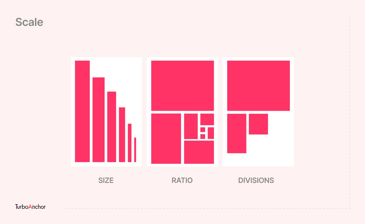
This design principle determines the relative size to signal interest & depth and how each design relates to another in size. In simple words, as the phrase goes, the bigger, the better. Elements in a design stand out that are bigger than those that are not noticed.
Gestalt
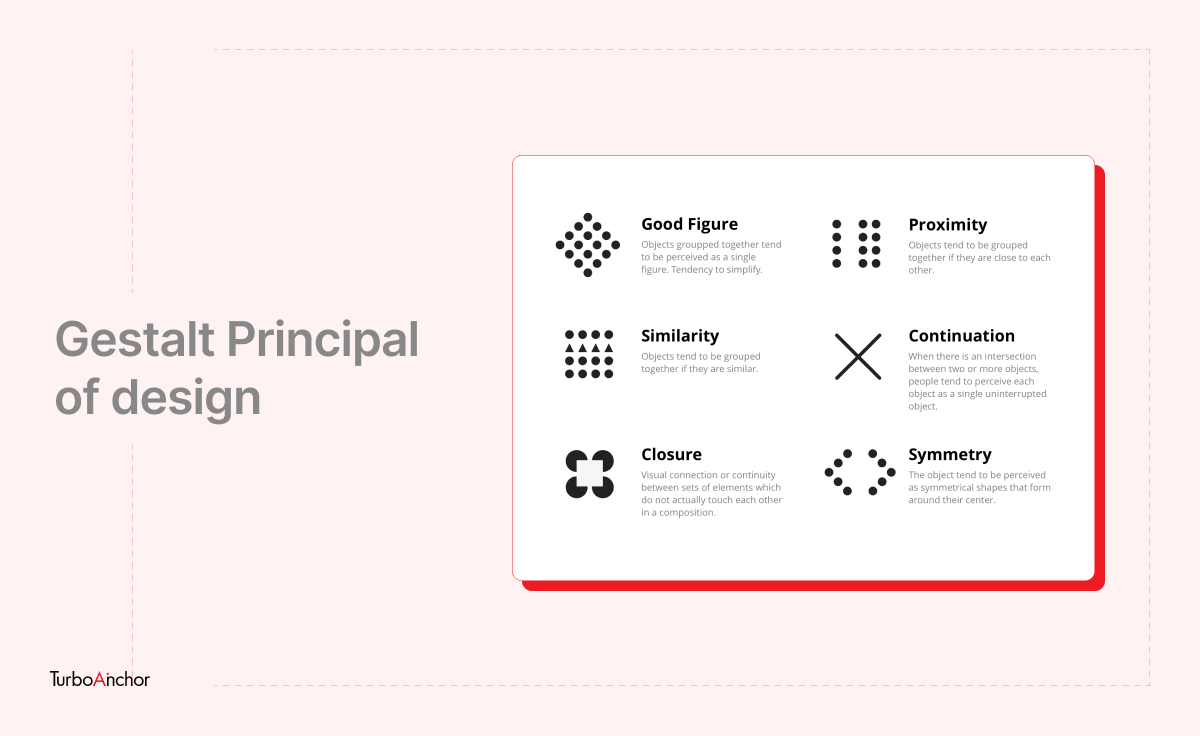
This principle explains how people can interpret complex images of multiple elements and arrange them into an overall well-organized design. Gestalt principles include similarity, good figure, proximity, closure, continuation, and symmetry.
Visual Hierarchy
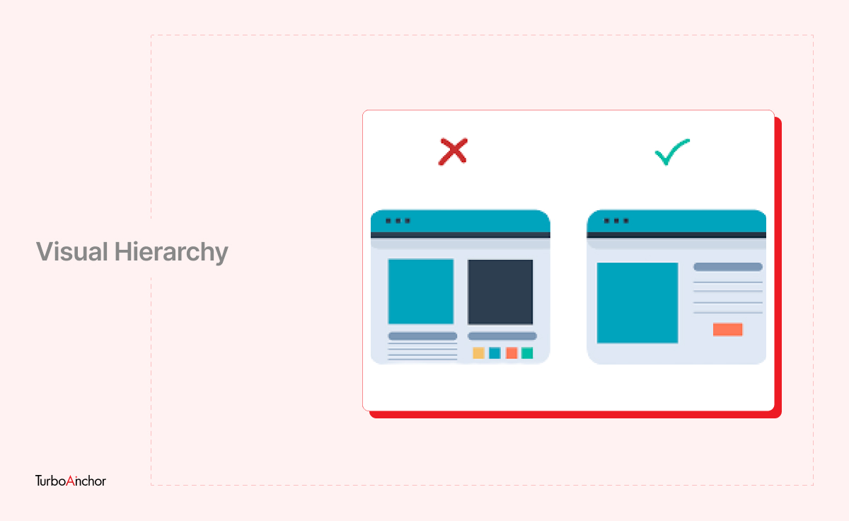
This principle is all about creating visual importance. The designer approaches design elements as layers of importance and arranges them effectively. Visual Hierarchy is created using placement, size, scale, value, color, and spacing on the page.
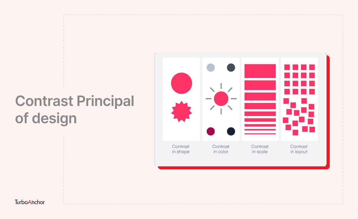
Contrast
This principle focuses on making certain parts of the design stand out. In simple words, the contrast creates a clear-cut difference (like color, size, directions, etc.) between two items.
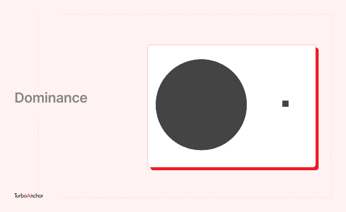
Dominance
An element containing all visual weights is the focus of this design principle. It’s the element responsible for attracting attention besides anything on the page. This is done using an item’s size, color, shape, and size.
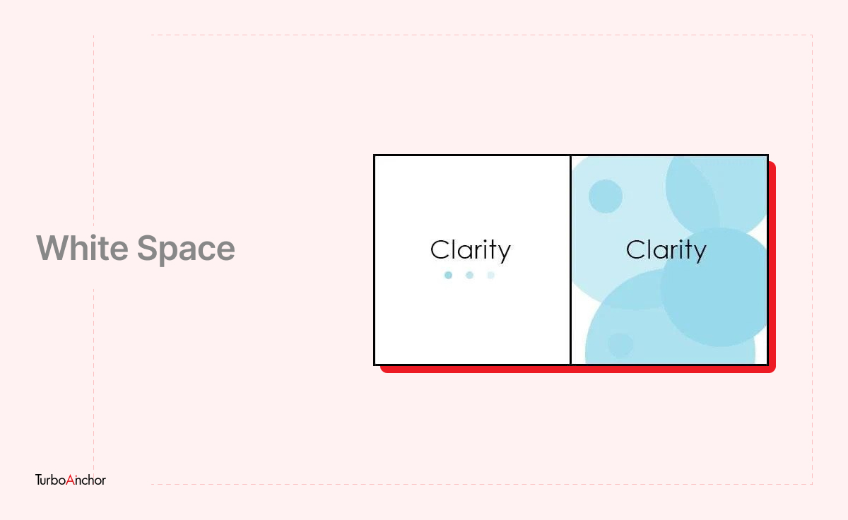
White Space
What is White space? As the name suggests, it’s the absent space between the design elements, but don’t confuse yourself that the space would essentially be white. For instance, the blank space between the text/font. The macro white space makes your design stand out by making its details more obvious.
FAQs
What is the difference between UI & UX?
UI (user interface) refers to the aesthetic elements of a site/app that the user interacts with like visuals, toggles, buttons, and icons. While speaking of UX (user experience) focuses on the user interactions with other products or services.
What is visual design vs UX design?
Visual design is concerned with helping users recognize controls, menus, buttons, and locations on a screen where they can perform actions. While when it comes to UX design it defines what should be on the screen and what interactions should reinforce Key Performance Indicators, such as engagement, adoption, and task success.
What does a visual designer do?
A visual designer is responsible for creating aesthetic artworks & layouts (for games, movies, apps) rather than just creating logos and icons.
Final Thoughts
You may have heard this before, that first impression is your last impression. When someone comes to your site or app, that’s the moment to seize the opportunity. The moment they come to interact will be the time they assess it from all perspectives. Therefore, investing time and money in Visual design will not just make you stand out but will leave a great influence on the ones visiting your site/app.
Also Read:
- Introduction to User Interface Design
- Discover – Difference Between Raster Image & Vector Image
- How to Design Mobile UI for Android Device